Text Styles Guide (Fonts)
the riginals
•
12/19/25
•
Guide
UI Text
Used for interface elements and navigation.
Logo Text
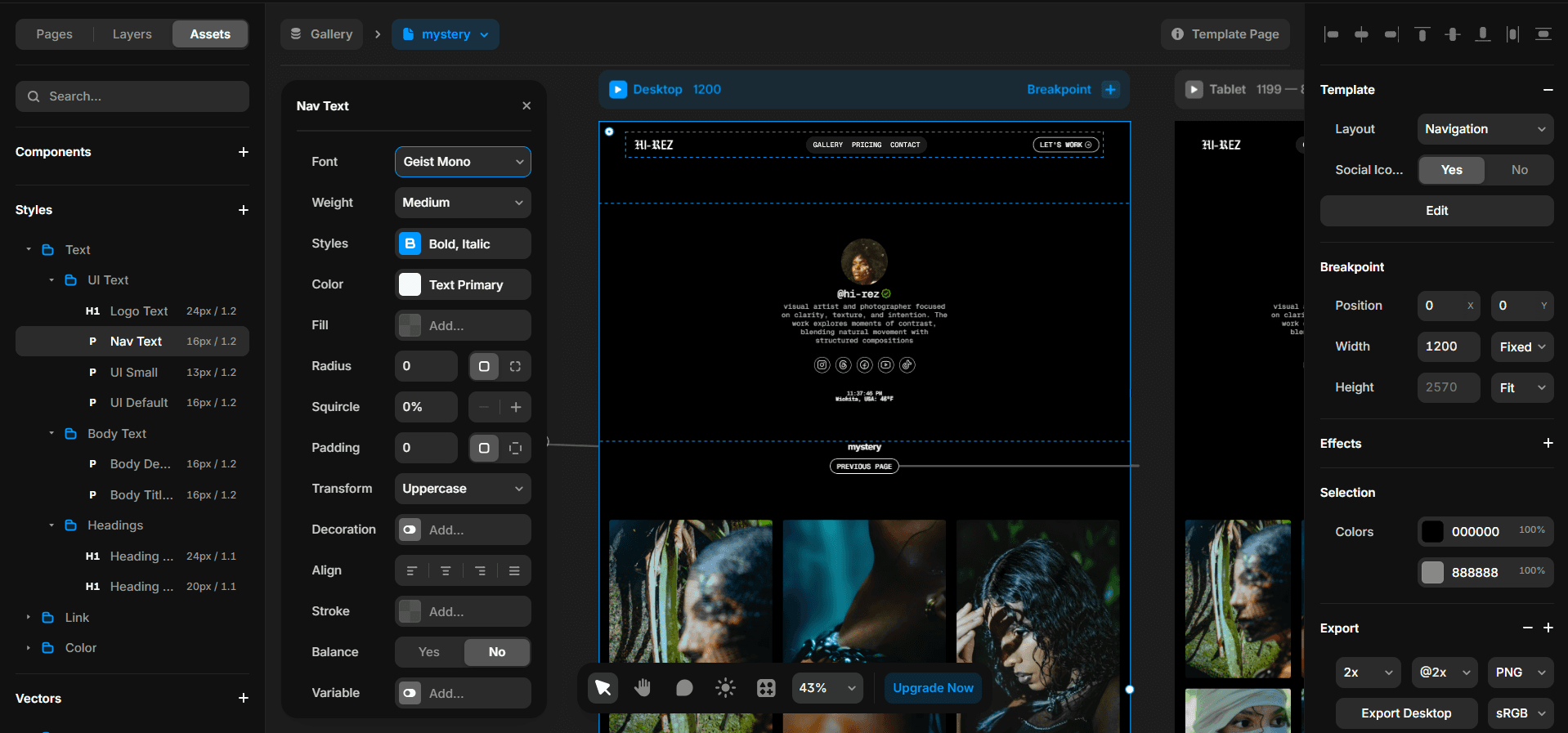
Reserved for branding and logo marks.Nav Text
Used in navigation menus and headers.UI Default
Buttons, labels, and standard interface text.UI Small
Metadata, tags, timestamps, and secondary UI elements.
Body Text
Used for readable content and descriptions.
Body Default
Paragraphs, descriptions, and long-form content.Body Titles
Section intros, card titles, and content group headers.
Headings
Used for structure and hierarchy.
Heading Large
Primary section titles and page headers.Heading Medium
Subsections and supporting headings.
Usage Guidelines
Always use text styles, never custom sizes
UI text should prioritize clarity over expression
Use body text for reading, headings for structure
Let spacing and size create hierarchy, not extra styles
Important:
Manual Components
A few components require manual updates. These include the contact form, the clock, and the current weather, which are located in the navigation and at the bottom of the links page.
As you explore the system, you’ll start to recognize components like these quickly. Over time, identifying what needs a manual update becomes second nature.
It’s recommended to use native fonts for the best performance and simplicity. You can also use custom fonts if you prefer, but make sure they are in WOFF or WOFF2 format.
These formats are optimized for the web and ensure faster loading and better compatibility.
Learn more about WOFF / WOFF2 fonts.